Visual Elements
The Generous Giving brand is more than logos, colors, and other visual pieces. It is the gut feeling people have about us. It exists in the hearts and minds of our clients. We don’t get to control our brand; we get to guide it.
The visual identity gives that brand life. It helps share our message in a way that is inspiring and memorable.
Logos
The Generous Giving logo is the most immediate representation of our company, our culture, and our brand. The following guidelines describe how to use it consistently in its proper, approved forms.
The logo
Stacked logo
When centering our logo, we often use our stacked version of the logo. You can find those files here.
Color
The colors in our palette communicate the joy and vibrance of our mission. We display confidence and excellence in everything we do; always inviting them on a journey of deep purpose. The colors enhance the user experience by drawing them through the information we’re communicating.
Color Pairing: Dos and Don’ts
Do:
- Dark Blue with Light Blue background
- Light Blue with Dark Blue background
- Dark Blue with Teal background
- Gold with Light Gold background
Don’t:
- Any color with Gold background
Primary colors
Dark Blue
Primary
#1C3F4F | PANTONE: 547 UP | CYMK: 97, 42, 36, 43
#2C5C6D | PANTONE: 548 UP | CMYK: 98, 27, 32, 46
#4E7B87 | PANTONE: 7708 UP | CMYK: 94, 0, 7, 52
Teal
Primary
#128EA7 | PANTONE: 7704 UP | CMYK:85, 0, 8, 16
#14A5C1 | PANTONE: 2230 UP | CMYK: 96, 13, 34, 0
#1EBAD8 | PANTONE: 638 UP | CMYK: 60, 0, 11, 0
Light Blue
Primary
#92C0E5 | PANTONE: 2142 UP | CMYK: 51, 17, 0, 0
#B5D4E5 | PANTONE: 651 UP | CMYK: 34, 11, 1, 0
#D7E9F2 | PANTONE: 642 UP | CMYK: 14, 3, 2, 0
Gold
Primary
#CF8906 | PANTONE: 131 UP | CMYK: 3, 36, 97, 9
Light Gold
Primary
#D4A653 | PANTONE: 110 UP | CMYK: 4, 17, 98, 7
Typography
Generous Giving’s primary typeface is Montserrat-Regular. It lets other visual elements do the talking, but its friendly x-height is easy on the eyes. Its shaping gives off a mature vibe while being pleasant to read. The typeface is used at various weights, primarily Regular (400) and Medium (500). To ensure optimum legibility, it’s best to avoid Light (300) or lighter weights.
Headlines
All headlines are set in Excentra Pro Light
Excentra Pro Light
Download: Excentra Pro Light
Explore a life with Jesus-like generosity.
Subheadlines
Subheadings are set in Amiri-Regular
Amiri-Regular
Download: Amiri-Regular
Uncover a generous heart. Step into a life of purpose.
Paragraphs
Paragraphs are set in Montserrat-Regular
Montserrat-Regular
Download: Montserrat-Regular
Generous Giving exists to help us all dig deeper into what it means to live with Jesus-like generosity. We explore generosity in a learning environment that never asks you for money, donations, or anything else in return.
Illustration
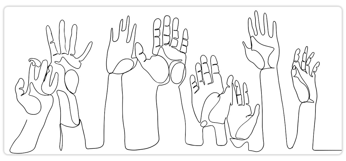
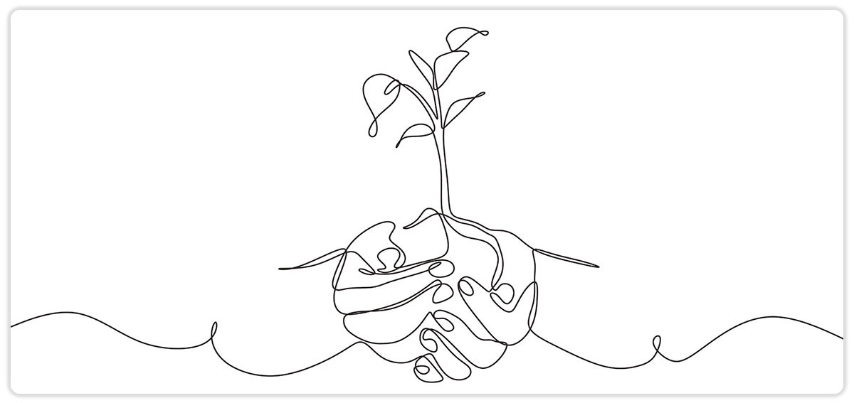
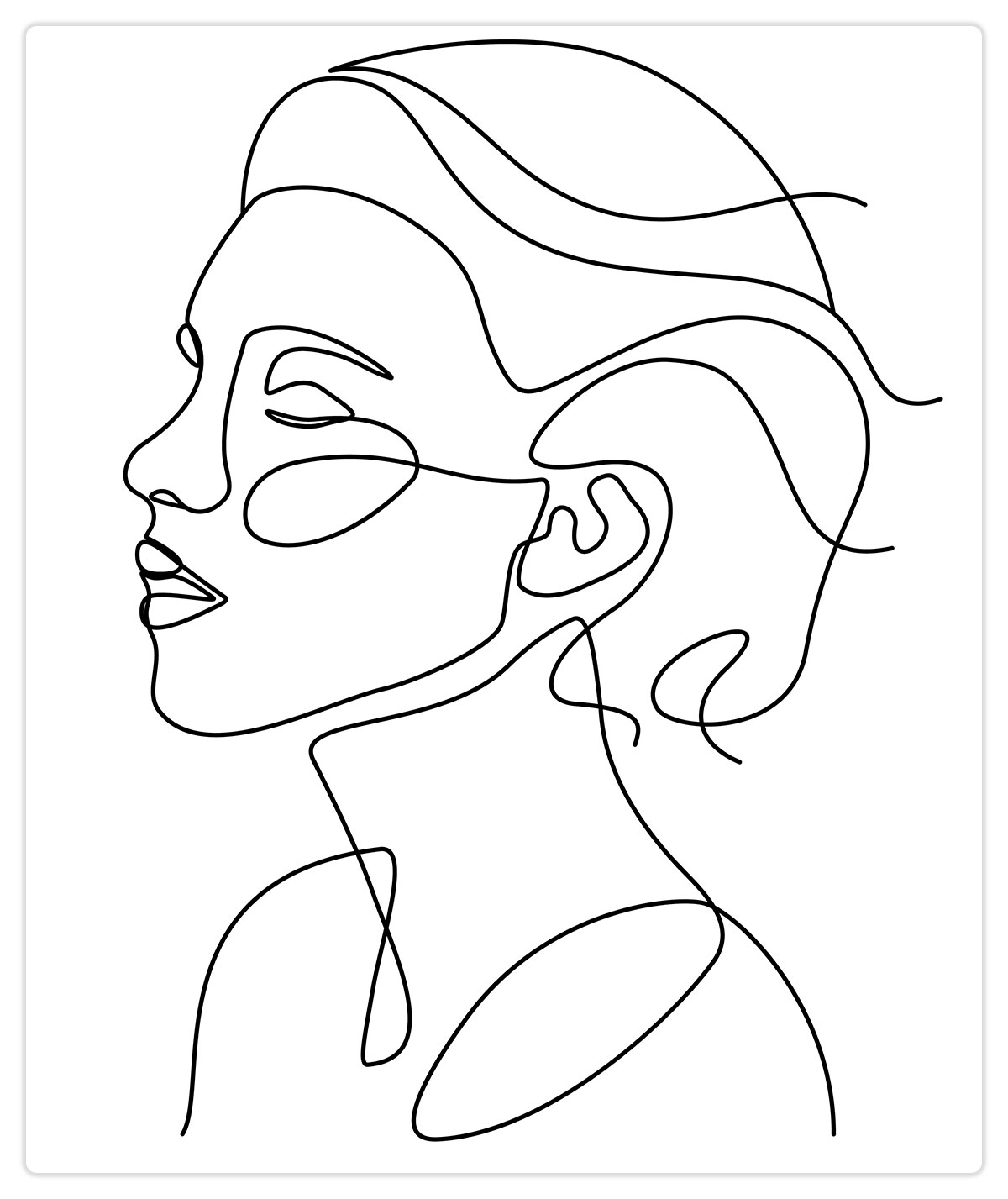
Illustrations can help center our brand around the story we are telling. The illustrations we use are single-line drawings that show the aspirations and value people find when they discover a life of generosity.
Graphic Elements
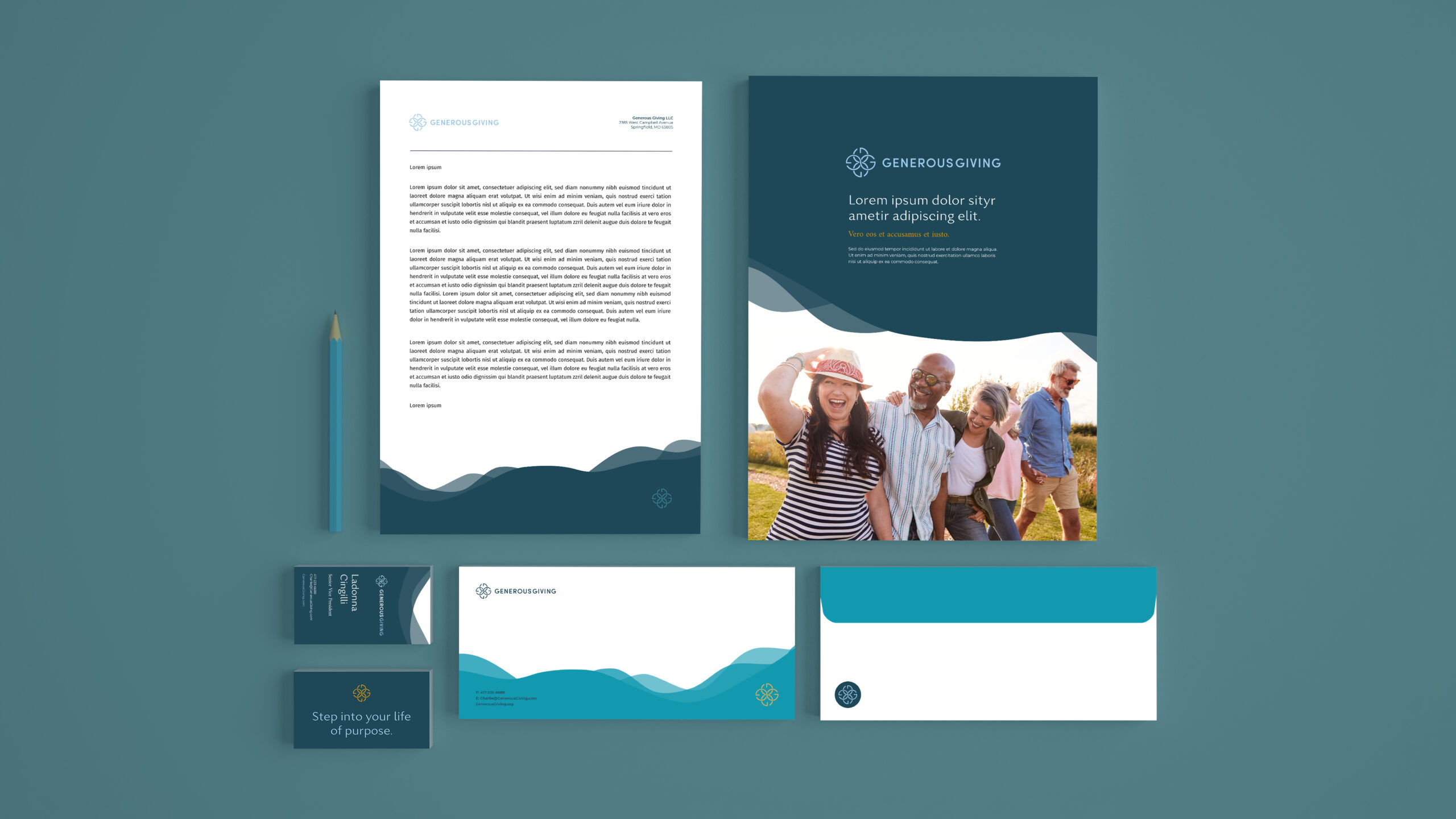
Following the lead of our illustration style, graphic elements are used to frame and support visuals, inject brand style, and create continuity throughout all our brand touchpoints.
How to use graphic elements
The organically shaped fills can be used as both a frame and a mask. Using the shapes as an image mask gives a custom, non-standard appearance to photography. Using the shapes as a frame allows them to enter the from the top, bottom, left, or right and to help direct attention through the communication piece.
Photography
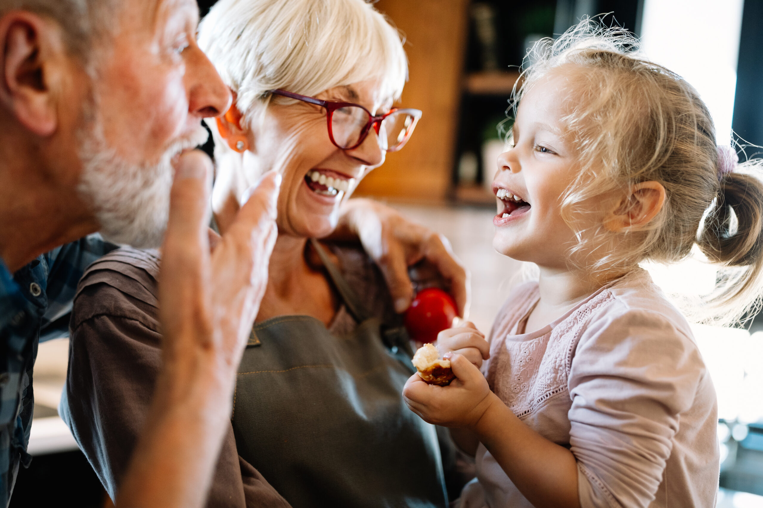
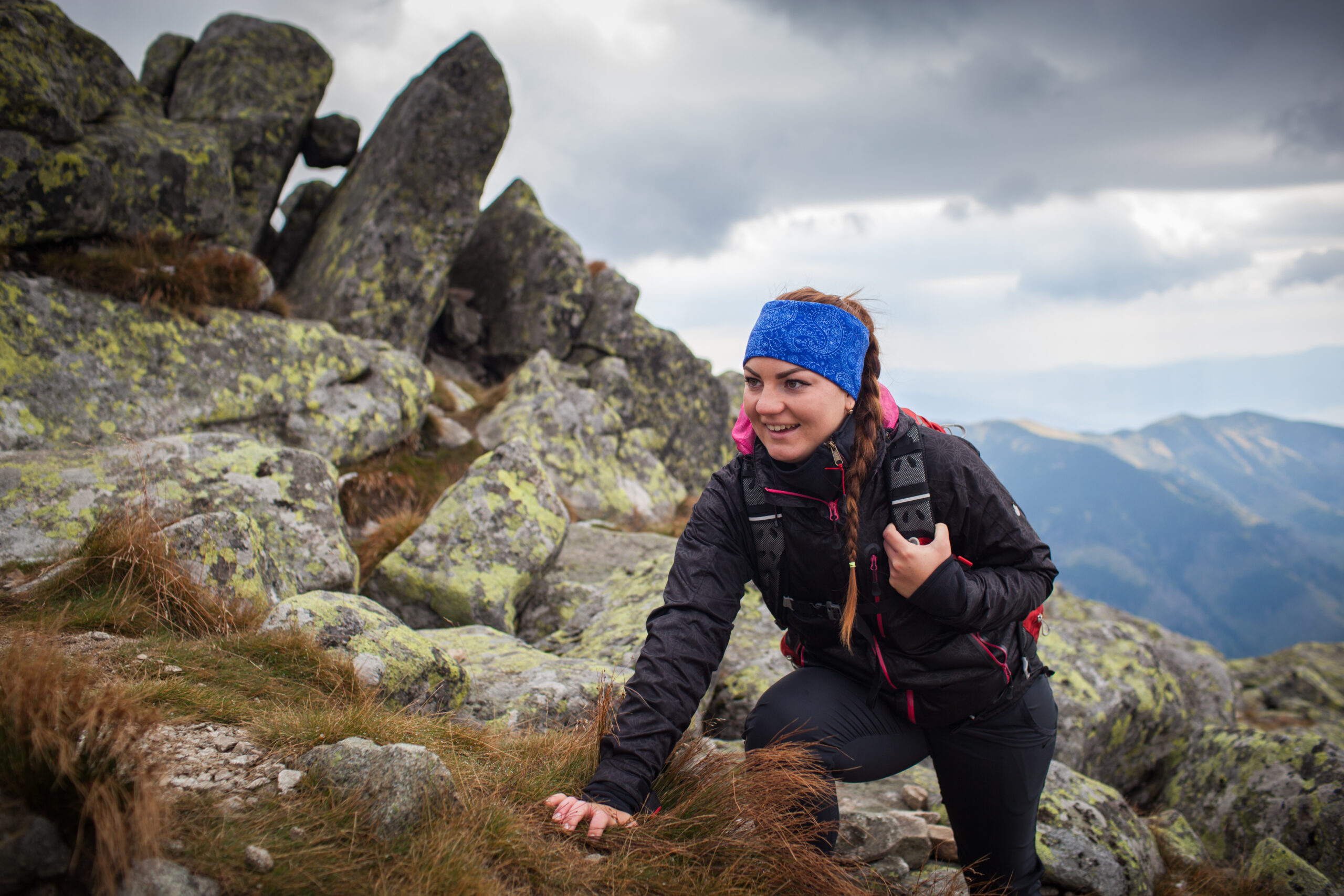
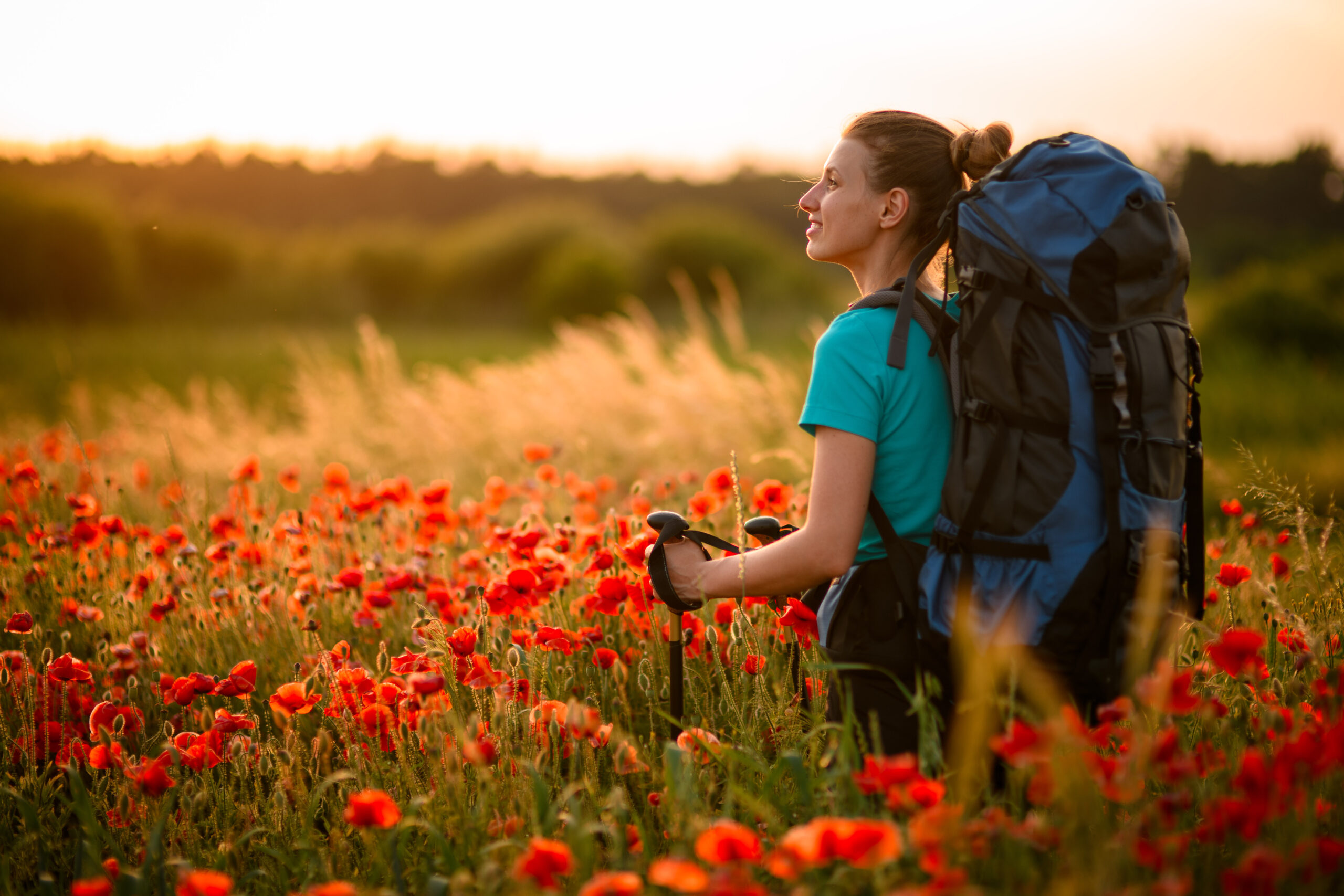
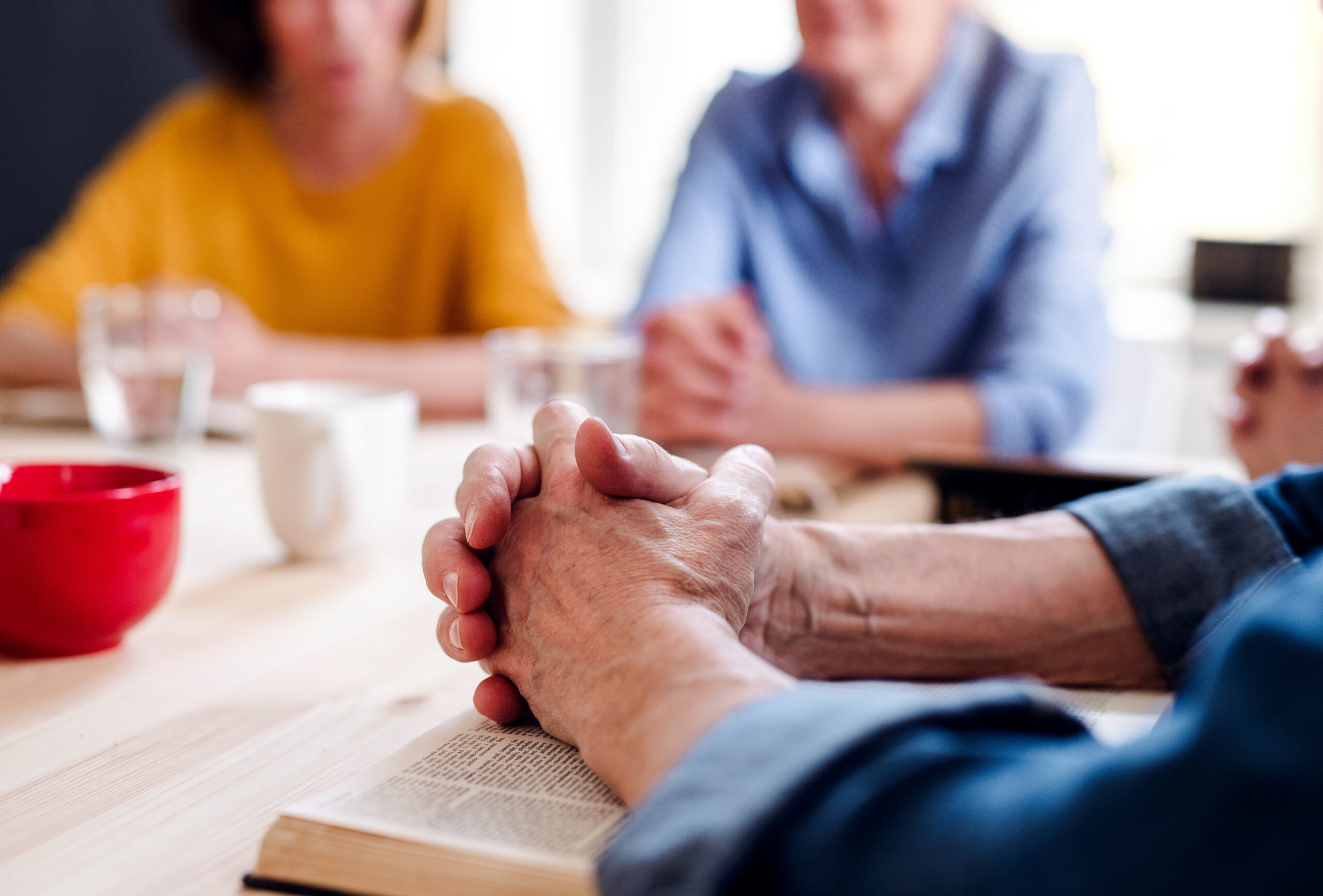
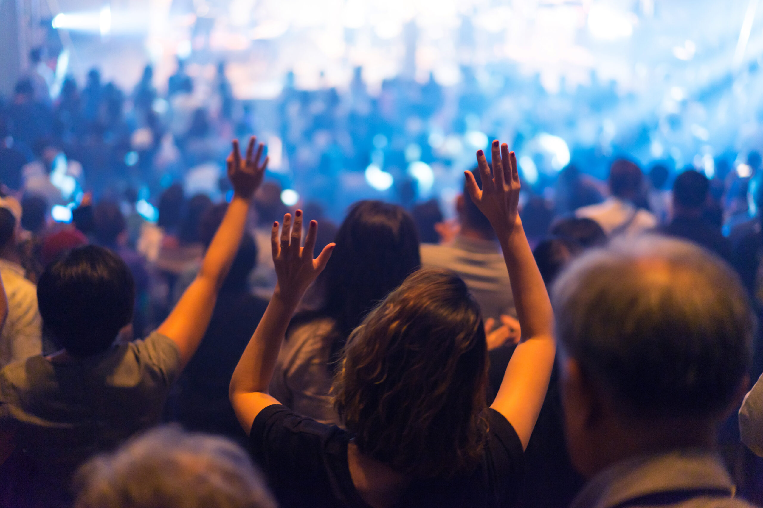
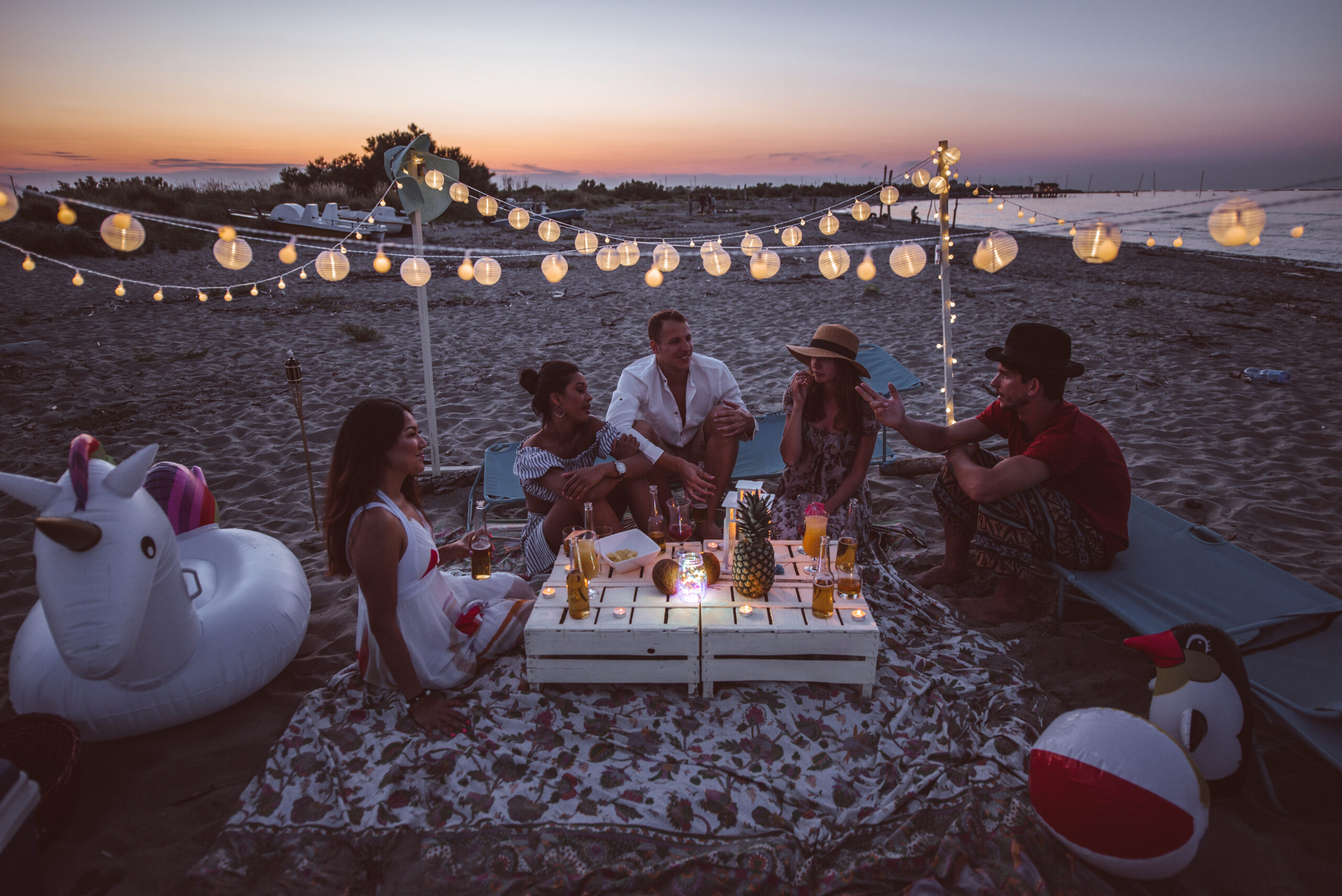
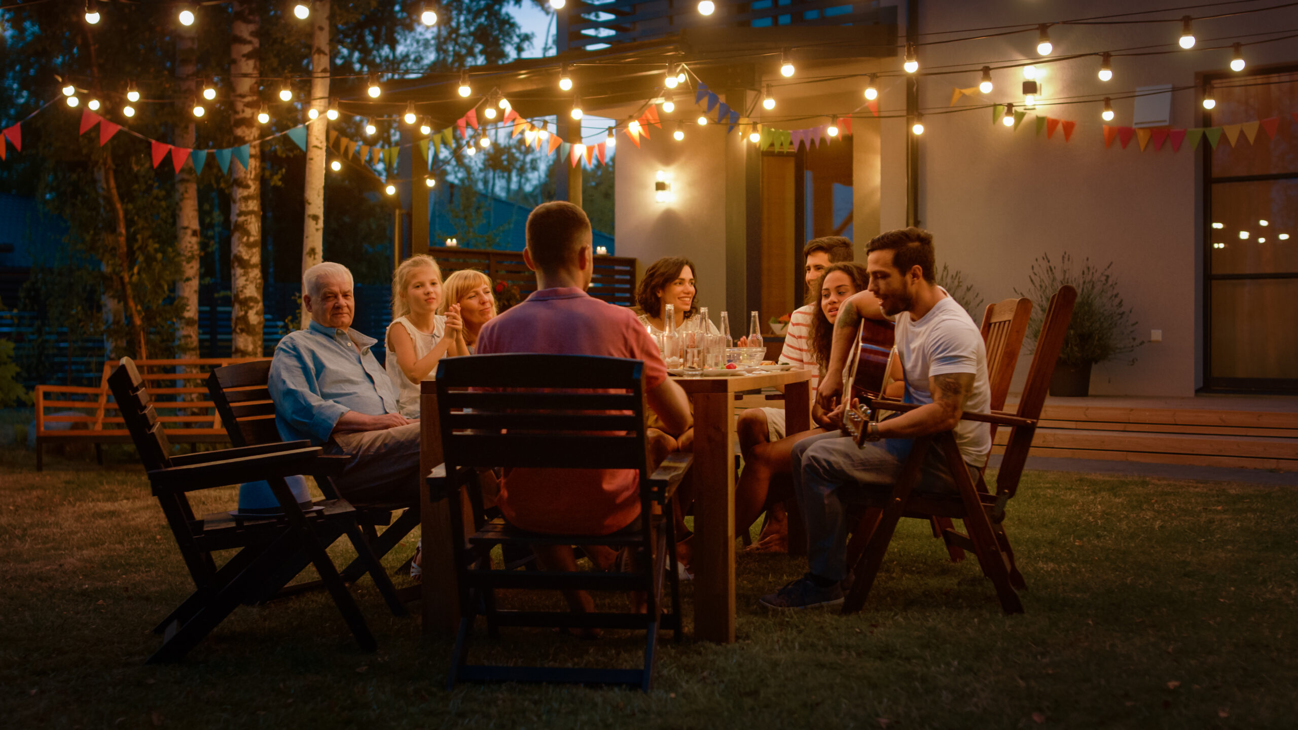
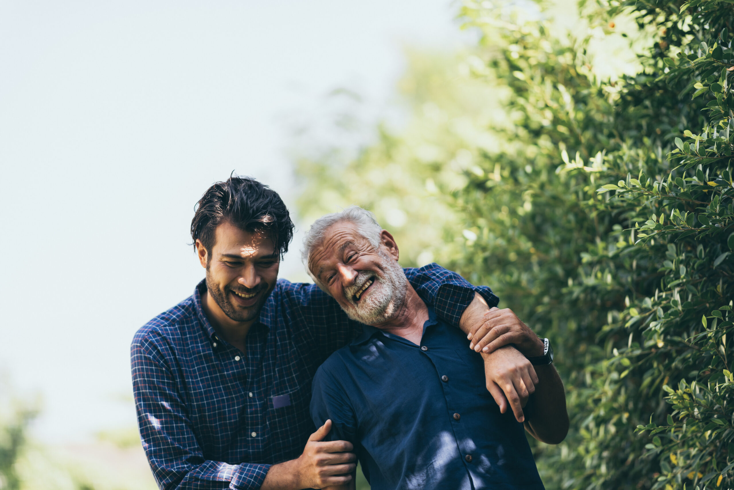
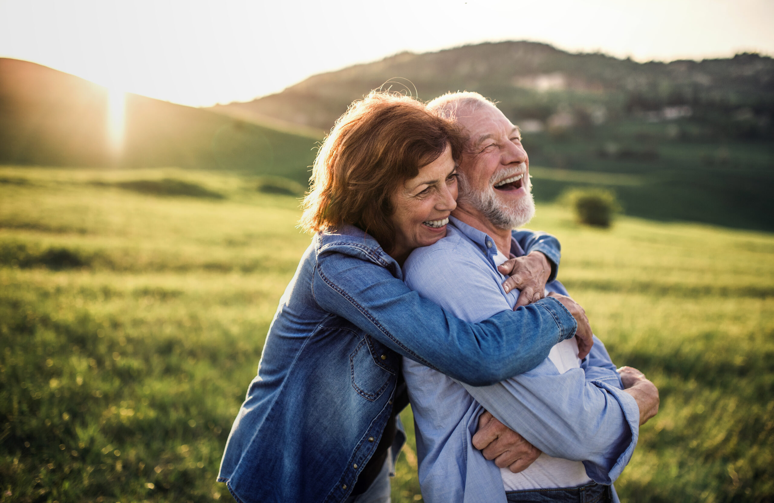
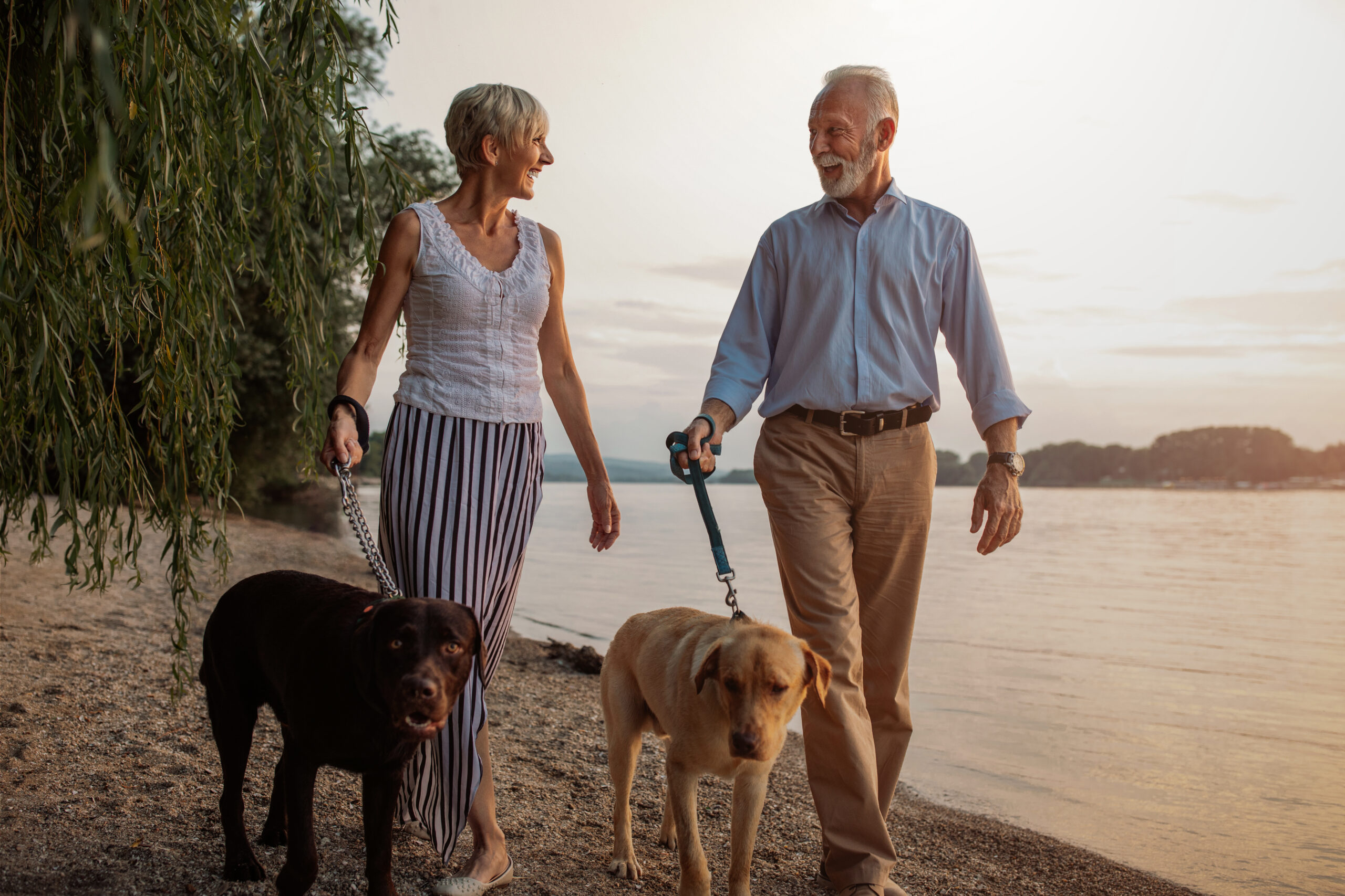
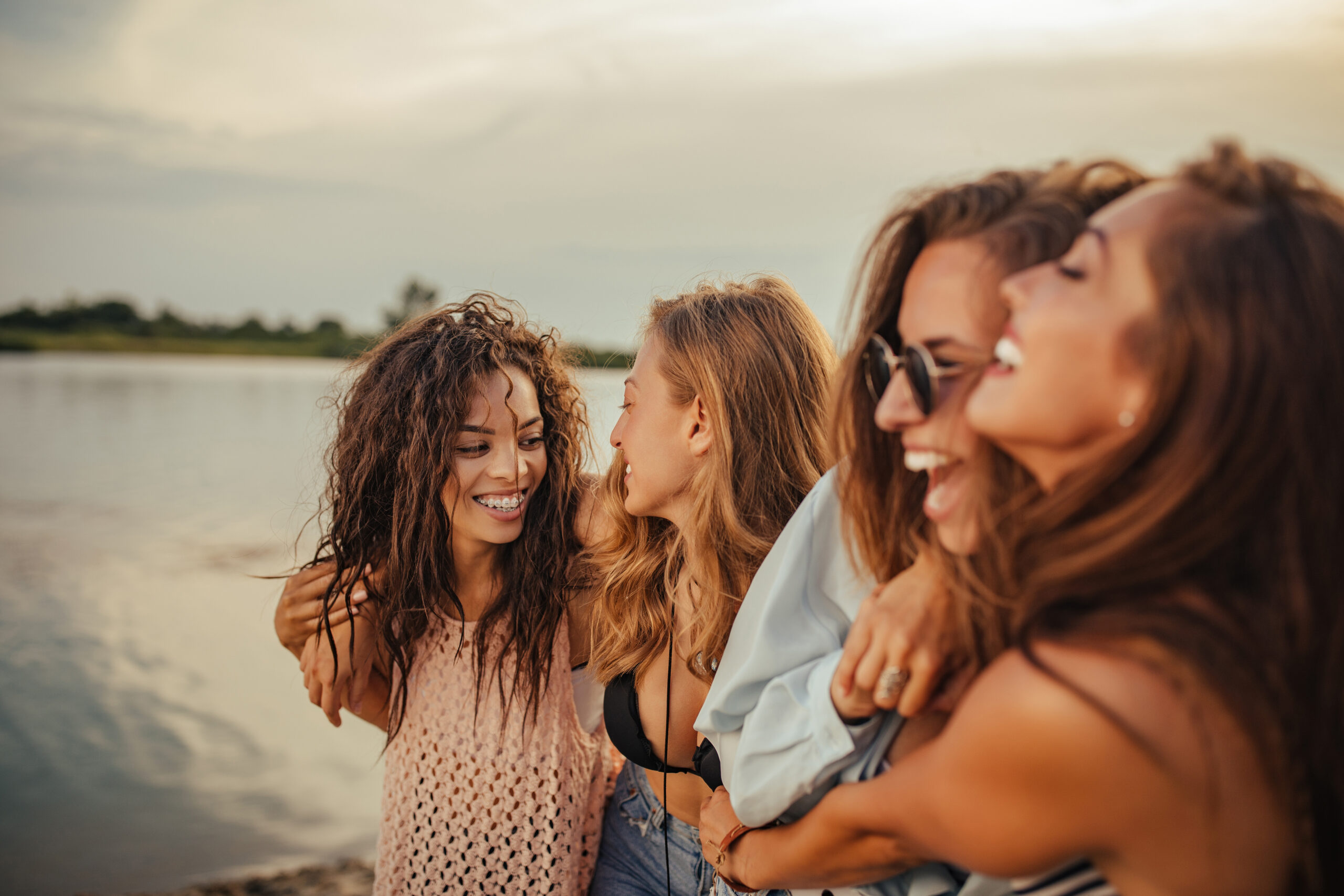
The GG brand also informs the aesthetics and features of the photography we use. Smart image choices offer us an opportunity to reach our target audience emotionally. Well-selected photography is the quickest way to tell a story. Help make we have a cohesive brand by following these guidelines:
Photography guidelines
- Genre: stock photography
- Environment: places of gathering and conversations
- Lighting: natural (or natural-appearing)
- Models: diverse, multigenerational adults
- Wardrobe: unbranded, high-quality, activity-fitting clothes
- Positioning and framing: center framed, camera unaware
- Color palette: warm tones
- Actions: conversations, gatherings, parties
- Emotional themes: joy, delight, cheer
Choose images that:
- Appear natural and spontaneous. Avoid photos that seem posed and unnatural.
- Offer a single individual or close-set of individuals for focus.
- Trend towards clutter-free and focused compositions.
- Avoid images that are over-complicated.
- Contain empty or open space around the subject.
JOG Stock Images: Download All
Modest Millionaires: Download All
Altruistic Entrepreneurs: Download All
Ladder Climber: Download All
Child of Wealth: Download All
Churches & Organizations: Download All
Celebrations: Download All
Family & Friends: Download All

