Deep Teal
#445A5A
RGB: 68, 90, 90
CMYK: 24, 0, 0, 65
The Generous Giving logo is the most immediate representation of our company, our culture, and our brand. It should be used with our color application guidelines in mind. The full logo should be used in most scenarios, but the mark can be used alone as an additional decorative/stylistic element.


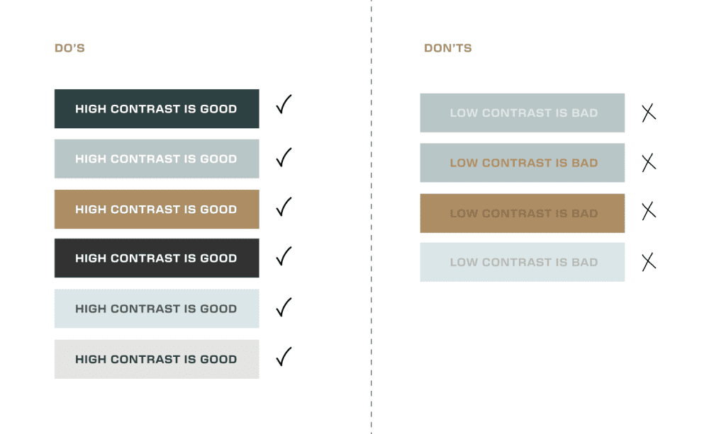
We primarily use Deep Teal, Ice, and Caramel, with accents of Sand, Grey, and Slate. It’s important to pair these colors in a way that creates high contrast so that our content is easily readable.
#445A5A
RGB: 68, 90, 90
CMYK: 24, 0, 0, 65
#D8E7E8
RGB: 216, 231, 232
CMYK: 14, 3, 7, 0
#B38B5E
RGB: 178, 138, 93
CMYK: 29, 44, 70, 5
#264142
#B5C7C8
#927049
#FEF9F0
RGB: 285, 250, 240
CMYK: 0, 1, 5, 0
#E4E4E4
RGB: 229, 228, 228
CMYK: 9, 7, 7, 0
#EBE2D2
#B9B9B9
Color Application
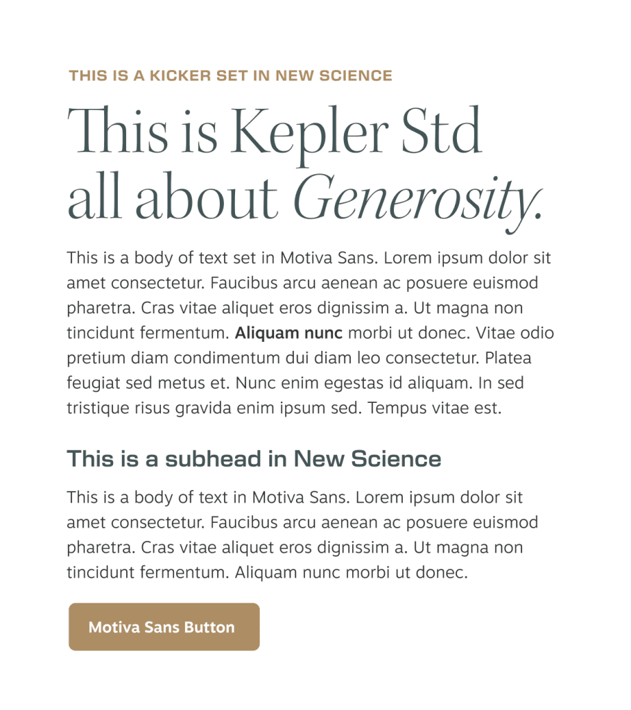
Kepler Std Light Display is used for primary headlines to create a strong, refined presence. We use italics on specific words for emphasis. This treatment doesn’t need to be used everywhere, but only in places where it can tastefully communicate that the word emphasized is important.

New Science is used for subheadings.

Motiva Sans is a modern, highly legible sans serif that we use for body copy.

Below is an example of our type hierarchy, and how each of these fonts should be used in context of headlines, subheads, and body copy.
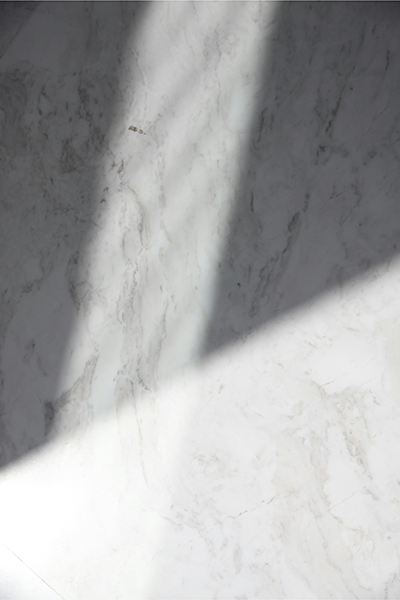
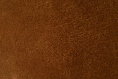
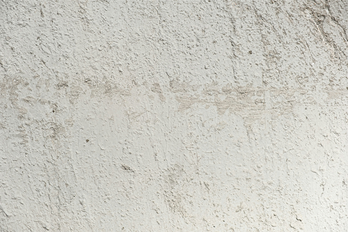
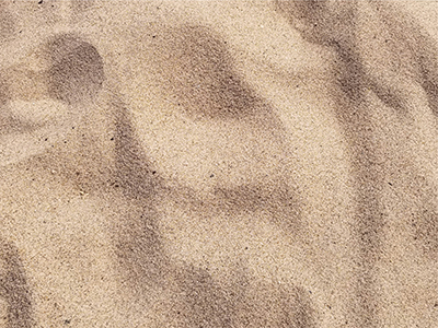
Textures are used to add a familiar element to any design. They are closely cropped, and typically work in the background of a design to create an experience that the viewer can sort of “feel.”
When choosing a texture to apply to the background, think about what will be subtly familiar to the viewer? Do you want it to feel soft? Restful? Specific to a place? It shouldn’t be distracting, but natural.
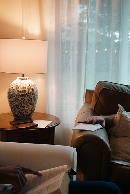
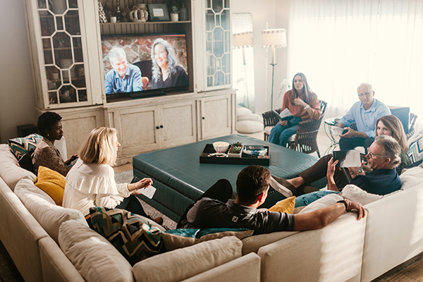
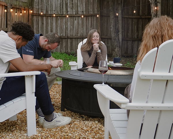
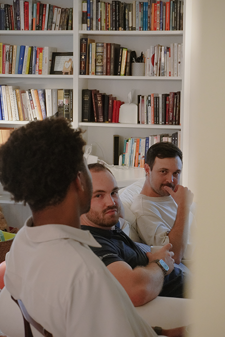
Our photography captures meaningful moments by zooming into details. We want to convey the feelings of joy and retreat through images such as writing in a journal, hands folded in prayer, emotion on someones face during a conversation, elements of hospitality, smiling faces at an event, etc.
The coloring of photos should fall in line with our brand color palate. Black and white editing in certain cases allows for the colors to be scaled back on a page where something else needs to take visual priority.
Use cases should strike a balance between setting photos, and people photos. We want the photos to feel authentic, relatable, and personal in the way they are captured, edited, and placed.